Showing posts with label digipak. Show all posts
Showing posts with label digipak. Show all posts
Monday, 12 March 2012

Why we chose to create two digipaks
We have decided to do two digipaks and two posters, we decided to do this because we had lots of different ideas of how to attract our audience and couldn't choose which one was the best. Therefore we will let you decide. We have kept a unique house style throughout both to ensure that it is clear to see which digipak matches together. We looked into some research on two digipaks as we wanted to make sure other bands and artist did this otherwise our digipak's wouldn't be realistic.


Here is the research we found :
Here is two covers of our band BLOC PARTY'S song Flux. This is the song we are doing so I felt it was essential to see if they created two CD covers first. Which they have done. As you can see the first one is very still and quiet where as the second one is a fast moving road with bright lights. They are both the same song and both show lights and emptiness. This shows that they do still relate to one another.
Here Jessie J has also used two front covers for one of her songs called "Who you are" She has kept herself on both of the CD's but she is posing differently in both. It is clear to see that even without her name and the song name both of the CD's are still hers.
After looking at both Bloc party and Jessie J it gave us an incentive to go ahead with our two digipaks.
Thursday, 8 March 2012
research into our digipak
Digipaks consist of a book-style paperboard capable of holding a CD or DVD attached to the inside. Digipaks were the first thing record companies used. I will be producing a CD digipak for the artist I will be creating a music video for.

 Here are some examples of the digipaks.


 All of these digipaks are by the band Oasis. The first digipak keeps a sense of house style through out with the orange fire look on the CD and the back cover. The second digipak keeps a house style with the yellow through out the whole digipak.


These are a few examples of CD. We are going to use the artist in our video and for a digipak, normally a pictureof the artist or group is used to promote the look and style. A picture on the front normally indicates what type of genre or style the artist or group is and this is what I want to achieve for my own digipak to promote the bands look as well as the music.
Here are some examples of the digipaks. All of these digipaks are by the band Oasis. The first digipak keeps a sense of house style through out with the orange fire look on the CD and the back cover. The second digipak keeps a house style with the yellow through out the whole digipak. The font used are similar on both as both the digipaks are Oasis. They have kept the same font on both digipaks so that it is easy for the audience to know that it is an Oasis CD without having to read the band name.
The picture on the front of the digipak relates with the genre Oasis try to associate them selves with because the man on the front looks like their age and how their style is portrayed. With the big hair and shirts.
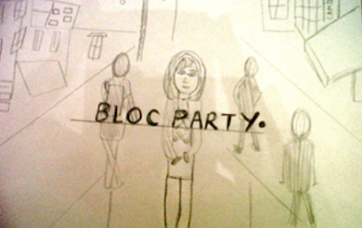
Here are some drawings that have been created of our future Digipak.


Wednesday, 7 March 2012
Digipak Poster. How we made it
The process of making our poster.
Here is the font we are using on our magazine advert, this is very similar to bloc parties font they usually use. We want to use the same house style as other bloc party posters to make our poster look alike and be recgonised.


Using www.dafont.com we come up with this font. The font is called CODE and looks very similar to Bloc party's font they usually use. CODE has a normal and a bold. The masthead is in the font CODE. We have chose to do this because by using this font it is clear to see who the band are on the magazine advert.


 Here is the gradual process of making the magazine advert, we added in relevant pictures to the music video and the poster. we then took tips from other celebrity posters when adding in effects. We added in rating, quotes and business icons!
 Here is the gradual process of making the magazine advert, we added in relevant pictures to the music video and the poster. we then took tips from other celebrity posters when adding in effects. We added in rating, quotes and business icons!
We feel this looks really professional lets hope the rest of our digipak does too!

 Here are the images from our video used and the business icons we used to make the poster look realistic.

Here are the images from our video used and the business icons we used to make the poster look realistic.Monday, 5 March 2012
Font for digipak
FONT

When looking at the font, we decided that we want to have as similar text to bloc party's other albums as possible. When looking at their text it is clear to see that it is quite robotic and straight. We came across the font, CODE on www.dafont.com.
The font comes in both bold and non bold, this is exactly what we want as bloc party usually have their band name as bold and the album name non bold.
After all deciding that this was an ideal text, we downloaded it to our computer so that we could use this in photoshop.
Wednesday, 29 February 2012
Music Adverts
For our Ancillary task we also have to make an Advert selling our music video that we have made. Before we start looking into what we want to do, we have to look at what other artists have done and see if we can take any ideas from there work. The adverts we are looking at are professional, real life adverts, getting ideas from that will make our advert look more realistic and sell better.

Make gif
Make gif
Here are a couple of adverts we have looked at, we should use these features to make our advert look realistic. Things that we like about each one and are hoping to use are..
Rhianna: The fact that her album is in the right corner is a great way of selling it. It shows viewers exactly what they are going to get. We will definitely be using this!
Jessie J : On Jessie J's poster there are business icons down the bottom of the advert. We will be using this as it shows the professionalism of the advert and how well know the artist.
Ellie Golding: has a unique house style on her advert, her title matches the same colour as her hair, although we will not be using this colour we will be using the sense of a house style.
Noah and the whale: We like that on the Noah and the whale advert they have a star rating of their songs, we are going to use this, it shows how our songs have been rated and can encourage people to buy our album.
Cold play: On the cold play advert, they have a promotional quote, telling viewers to order from Itunes and get a CD delivered straight away. We want to use this as we want to promote our album as much as possible.
THINGS WE ARE GOING TO USE IN OUR ADVERT
± PROMOTIONAL QUOTES
±RATED SONGS
±HOUSE STYLE
±BUSINESS ICONS
±ALBUM COVER DOWN THE BOTTOM
±LIST OF SONGS ON THE ALBUM
Monday, 27 February 2012
Research into the making of our Digipak
When talking to our teacher with my group we came to the conclusion that our front cover needs to link with whats in the video. When the audience watch the video and then want to buy the album they need to be able to know what album links with the video with out having to look at the title and the band name. This means something from our music video must be on the front. We need to keepa tangible link between all three of our media products.
After thinking hard we realised that the front cover we wanted to use, would be unacceptable as that scenery wasn't featured in our music video. Therefore we have decided that we can still keep it for the CD holder as we want to also keep a link between the band as well as our video. By keeping this we making a link between our digipak and other Bloc party.

Here is the layout of our digipak that we have to adhere to, we have the front cover, the inside cover, the CD holder and the back cover to create!


Here is what the two of our digipaks would look like on the layout of the CD we have. They are both of our digipaks as we made two because we had to house styles that we wanted to meet.
Saturday, 18 February 2012
Research into digipack
After looking at other similar bands albums covers I am now going to look at Bloc party's other albums covers.
This way I can see what parts of the album covers are used again and again and which parts I should keep on my album cover to make a house style.
Bloc party album covers

When looking at Bloc party's albums I noticed that their title was the same on all albums. The titles also included a false stop after their band name. This is a great sense of house style. That I feel we should keep when doing our front cover. Buyers will recognise Bloc party's albums by the font of the title and the specific full stop after the bands name. We want our Album to be recognised so therefore the same font and full stop should be used on our album too, making the house style follow throughout. The font as shown will always be in white. And the song name underneath the bands name will be kept slightly smaller.
The album cover picture have been selected in an extremely clever way. The top left picture is named "Silent alarm" They have created a silent alarm by putting a picture on the front which has nothing but trees in the background on a winters night. There is nothing around except the trees making the surroundings silent. The picture and the title gives an ominous sense to it.

Now that we feel we have our font sorted we need to see how it looks on a photograph. A lot of Bloc party's album covers were location shots, so we decided that first of all we will see what our font looks like on a location photo of ours seeing as we had taken a lot when filming.


This way I can see what parts of the album covers are used again and again and which parts I should keep on my album cover to make a house style.
Bloc party album covers

When looking at Bloc party's albums I noticed that their title was the same on all albums. The titles also included a false stop after their band name. This is a great sense of house style. That I feel we should keep when doing our front cover. Buyers will recognise Bloc party's albums by the font of the title and the specific full stop after the bands name. We want our Album to be recognised so therefore the same font and full stop should be used on our album too, making the house style follow throughout. The font as shown will always be in white. And the song name underneath the bands name will be kept slightly smaller.
The album cover picture have been selected in an extremely clever way. The top left picture is named "Silent alarm" They have created a silent alarm by putting a picture on the front which has nothing but trees in the background on a winters night. There is nothing around except the trees making the surroundings silent. The picture and the title gives an ominous sense to it.
The second album with two people kissing, is called "Intimacy" there is nothing more intimate then two people kissing. Its simple yet effective and explains the song title easily.
The albums another weekend in the city, has a picture of bright lights on a big building in the city. They way Bloc party have explained their titles in simple yet effective way is exactly what we want to do.
When looking at the albums we have chosen to research from there are not any photographs of the band members of Bloc party so we will not be using a picture of the band or people pretending to be the band.
When looking at the albums we have chosen to research from there are not any photographs of the band members of Bloc party so we will not be using a picture of the band or people pretending to be the band.
WHAT WE NEED TO DO NOW...
Now we need to find our font that we want to use, we know that we want the exact same as the other albums, we just need to find it now! We are going to use the website we used when creating our AS media work... http://www.dafont.com/
We came across the font "Abeat by Kai" which looked quite circular and similar to the font used therefore we downloaded it and thought we would have a look at it on a real photograph as a almost template.
We came across the font "Abeat by Kai" which looked quite circular and similar to the font used therefore we downloaded it and thought we would have a look at it on a real photograph as a almost template.

Now that we feel we have our font sorted we need to see how it looks on a photograph. A lot of Bloc party's album covers were location shots, so we decided that first of all we will see what our font looks like on a location photo of ours seeing as we had taken a lot when filming.

Here me and Vicky edited our location picture and then Sophie added on the text. We feel that for a first attempt it looks pretty similar. We've kept the theme of locations and have kept the font style so that a house style is kept throughout all albums.
Here is how we made it...

Vicky put a little collage together of Bloc party's albums including ours..

Can you tell the difference?
Friday, 17 February 2012
Research into our digipack
When looking into research for my digipack, it was clear to see I had to look at other same genre of music CD or album covers. I needed to know exactly what it is that first attracts the buyer to the CD or ALBUM - The front cover.
The front cover and the rest of the digipack. The digipack is something that the buyer can take home, its there's to keep.
I looked at a couple of bands that I felt has similar music taste to Bloc Party- as this is the band I am doing the digipack on.
Similar bands with the same genre:
1. Cold play
2. U2
The front cover and the rest of the digipack. The digipack is something that the buyer can take home, its there's to keep.
I looked at a couple of bands that I felt has similar music taste to Bloc Party- as this is the band I am doing the digipack on.
Similar bands with the same genre:
1. Cold play
2. U2
First I will start with the album cover.
Cold play album covers

U2 album covers


U2 album covers

Looking at both U2 and Cold plays albums it is clear to see that they have a coherent house style that can be used for examples and ideas for when we create our front cover. The bands pictures on the front of their albums are also quite plain but extremely eye catching. They catch the attention of the buyer. Although not all of them have a picture of the band on the front cover, looking at both bands albums some of them do. This helps sell the record as the buyer gets to see pictures of the singers as well as here them.
Although the pictures on each album cover change the font always stays either exactly the same of slightly similar, for example the band names U2 and COLD PLAY are always in the same font. Cold play also keep the name of the album in the same font. Keeping a great house style to the albums. With out the name of the band a customer or a fan would still know that it was a Cold play.
Although the pictures on each album cover change the font always stays either exactly the same of slightly similar, for example the band names U2 and COLD PLAY are always in the same font. Cold play also keep the name of the album in the same font. Keeping a great house style to the albums. With out the name of the band a customer or a fan would still know that it was a Cold play.
From looking at both of these albums I now know exactly what I need to do to make sure my front cover is unique yet keeps a house style and fits the genre of music.
I will research other Bloc party album covers keeping in mind about the house style and font style.
Subscribe to:
Posts (Atom)