Tuesday 20 March 2012

Evaluation 2 (By Emily Fry)

How effective is the combination of your main product and ancillary texts?

Our music genre is Indie.
A typical target audience for our genre would be a boy ages 16-25 that enjoys listening to music such as Cold play, Oasis and The Killers. He would enjoy going to festivals and talking to friends about different bands they like and dislike. He would go out and "chill" in places such as Camden and London where he is able to skate and look at sights and listen to music freely. He would read magazines such as NME and wear skinny jeans with boots and long coats. Very much how our actor Jake dresses.

Here is my script to my video that I have produced showing how effective the combination of our main product and ancillary texts are.

Presentation1


WHAT WOULD WE CHANGE?
If i was able to go back and re-design all three platforms there would be a couple of things I would change about all.
The video - I feel that our group should have planned much more in advance, as it was our first time filming and editing. We underestimated how important the editing was and didn't give our selves enough time to edit as well as we could. Some things we hadn't planned properly and missed out meaning we had to go out and re-film some things. I would probably plan our story board better for our final cut and ensure that we got each part of filming done at least twice in different places so that we had a choice to edit. The colouring of our video was bleached out on our actors face so I would try and change that next time round as well. We tried to change it in Photo shop but next time round i will spend longer on it.
The Poster - The poster was our strongest point of our three platforms. We made the poster apply to both of them. I felt that our poster had a great Indie feel to it and that it was well suited to our music video. If we were to change anything I would try and change the pictures on the front to make them clearer.
The album artwork - As we wanted to take images from our music video we were limited on what we could use on our digipak. However we found two great pictures with our actor opening his eyes for the front cover and him closing his eyes for the back cover. The lay out and structure of the album were great. However I would change the colouring of the pictures used if i could do it again. Making them slightly less bleached out.

Tuesday 13 March 2012

Evaluation 1 (By Emily Fry)

In what ways does your media product use, develop or challenge forms and conventions of real media products?

The genre of our media video and promotional package is Indie.The key forms and conventions of a Indie music video are:


- lots of close ups of the artist/band
- low key performances
- the untailored, "i don't care" appearance
- the use of strobe lighting
online gif maker


When looking at the structure and ideas for a Indie music video, we did our research on Andrew Goodwin. His book "The rise on MTV" had some extremely interesting facts and features that we were going to take into consideration for our music video.
- Music videos use the singer both as a performer/narrator and as a character.
This is clear to see in our music video as we have our actor Jake singing through out the whole song as the performer, yet we are still telling a story about his state of flux in his relationship. This being the narrative. Our actor Jake is being both the performer because he is singing and the character as he is also acting out the narrative. Through out the song Jake is singing for example when he is in the chorus he is singing being the performer but he is also showing his frustration and worry by his acting.

Andrew Goodwin also wrote that a music video should “Demonstrate the iconography and genre characteristic within the genre” and that “there is a relationship between lyrics, music and visuals, either illustrating, amplifying or contradicting the music” Our music video shows that it is in the Indie genre. With our actor who has been made to look, dress and act Indie. And the song and the lyrics them self. There is also a relationship between the lyrics, music and visuals of our song, illustrating and amplifying the music. We have illustrated mainly in the song for example when the song lyric is "if your right hand is causing you pain, cut it off" we have an overlay of a knife running down an arm while our actor is lip syncing and performing.

We looked at many different Indie music videos before making our music video for research. We looked at videos that showed us different overlays, cuts, lighting, camera work and close ups. For lighting and fast cuts we looked at Rihanna and Kanye West - All of this lights. For overlays we looked at Pixie Lott - Its all about tonight. We also looked at camera work and close ups in The Script- For the first time. Our ideas for lip syncing were taken from a range of Examples song mainly - Kick start, as there are many close ups of him singing and split screens of him and other characters in the narrative.


online gif maker
Online gif maker

Here our the Indie music conventions we used in our music video and ancillary task.


1. Editing - In Indie music videos most editing is quite a fast pace, with a lot of shots in a short amount of time. The cuts are quick and only a few overlays are used. A fade in or fade out or both are usually used in a indie music video. In our music video we have a variety of fast paced shots . Our temp is fast and our shots match this. In the chorus the editing is faster due to the faster tempo. The editing is the fast upbeat part where we use strobe light and cut every two or three seconds for the whole of the editing. Other fast parts of the editing are near the end when "state of flux" is being sung. This is when there are single shots of my self and our actor Jake and the pace of the editing increases with each shot. When wanting to make sure we were getting out editing correct we looked at fast beat songs such as Kanye West "All of the lights". Throughout the whole song the cuts are extremely fast and there are a lot of them.


2. Lighting - The lighting is often made rather then natural light in an indie music video. Either strobe lighting and disco lights or a stage effect when the artist is performing. Low Key lighting is used a lot within a music video. Some of our video is full of ambient lighting due to the time we had to film as we wanted it to be during the day so that the lip syncing our acting was doing was clear to see, how ever the camera we used did not pick up the images well. In our chorus however we were able to use strobe lighting which was fast paced and linked with the beat and timing of the music well. The lighting from our music video was taken from Ellie Golding - Lights.


creating a gif
Creating a gif


3. Camera work- As a lot of Indie videos are performances band members or the artist will usually look into the camera. Shots are usually hand held to give the video a more indie vibe effect. We made sure that our artist Jake was filmed in every scene looking into the camera whilst singing. Making him look into the camera made the music video look more realistic. We also used a number of extreme close ups, medium close ups and long shots to ensure we had a variety of shots for our viewers. This means that the audience and fans watching can easily see who he performer is and will be able to recognise the artist. Long shots and medium shots meant then whilst Jake was lip syncing we could also show his body language and his acting skills. We used a tripod to keep our shots steady


creating gif
Creating gif


4. close ups - Close ups of the artist are usually used to encourage the fan to buy the CD. Close ups can be used a promotional point as the more close ups of the artist the more the fan is going to want to watch the music video and start liking the song, then buying the CD. We have used many close ups of our artist Jake, at the beginning and at the end of our song. Bloc party also use many close ups of themselves in their music videos.


5. strobe lighting- Strobe lighting can sometimes be used in indie music videos when wanting to add drama and an exciting edge to the video. We have used strobe lighting in our chorus as we wanted to add to the confusion and state of change Jake our actor was going through. We wanted to add more emphasis on his feelings as he doesn't know what to do or how to think any more. We got our idea of the strobe lighting effect from Rhianna and Kanye West, "All of the lights"


6. Lip syncing- Lip syncing is used in mostly every music video especially in Indie music videos as they are mainly performance based. We have made our actor Jake lipsync through out the whole of the song as we wanted our music video to look as realistic as possible. Jake sings through out all the video and very rarely looks away from the camera. We got our inspiration from Cold play. The lead singer in Cold play constantly sings and looks into the camera.


creating gif
Creating gif


7. split screen- Split screens can sometimes be used in music videos when wanting to get two peoples emotions or reactions across as the same time. We have used ours because we wanted both our actor and actress singing the same line. Our split screen is of the mouths. We got our inspiration from Example's music video where he is trying to get across a male and a females emotions.


creating gif
Creating gif


8.over lays- Over lays are used in music videos to help transitions between each cuts. We have used a couple of overlays as not many are used indie magazines. Three overlays are used in our music video. For example one time is at the beginning as we are trying to get across some one in pain. "if your right hand is causing you pain cut it off" so while Jake is singing we have an over lay of a knife slicing down a arm. We got the inspiration of overlays from Pixxi lotts music video, although hers is a fast paced song like ours her use of overlays match the pace of her song well.


online gif maker
Online gif maker


9. two people shots- Many Indie music videos tell some sort of story, they usually have some sort of death, romance or loneliness in them. Ours shows loneliness. We have used two people shots to portray this loneliness as our actor Jake is often seen looking back on memories with his partner. Then being seen alone and miserable on his own. The shot of both our actor and actress makes it easier to portray the sense of loneliness and upset he feels without her. For example we have a scene where they are both together sitting at a table talking and it cuts to just him sitting at the table on his own looking dazed and sad. I feel this is a great way to show a past memory but also some ones emotions.


online gif maker
Online gif maker

Ancillary tasks

Music Advert 1 and 2 :

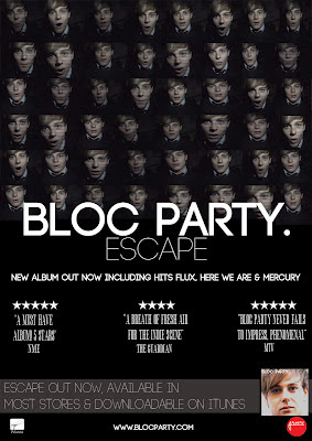
Image of Actor- Images of the character are always shown on the front of the advert. Images of the artist are shown on the front of the music advert because it helps sell the product. When fans see a poster of an artist they like, they automatically know what song and who sings it. This helps promote the music video and encourages viewers to buy the CD. On our poster we decided to use the same picture as our front cover of the CD picture. Just like Jessie J has on her music advert for "Who you are". To make this advert picture we use inspiration from our video and wanted to show some of the same shots that were in our video. We feel that using the same picture for both helps link the m
usic

advert to the CD. For our second poster we still used the same picture but it wasn't our CD digipak front cover.

Ratings- On both of our albums we used star ratings. We made up that MTV, The Guardian and NME rated the music video. By doing this it makes our music advert look more realistic and shows people what other viewers think of it. This could be influencing them to buy it as our ra
tings were quite high. We found inspiration for this from the magazine advert "Noah and the whale"

Band name and album fonts - We wante
d our band name and album font to be exactly the same as the CD and Bloc party's other music adverts. We wanted to do this because we wanted to keep a house style through out our music advert and CSD but also through out all of bloc party's albums and music adverts. For this we obviously used Bloc party as our resource to look at. We looked at all their album covers and magazine adverts.

Quotes- We used Quotes on our music advert as we wanted to show viewers what opther people felt about the music video. We used high end music chan
nels such as NME and MTV to qoute exceptional things about the music video. This way we could ensure that we would be encourageing viewers to buy the CD. We used the magazine advert from Jessie J who had many music channels and news papers commenting on her song.

Business Icons- Business Icons were a perfect way for us to ma
ke our music advert look professional and well presented. They show the record labeland business icons that either sponsor or are apart of make the CD. We got the idea of business icons also from Jessie J's music advert.

Promotion of the album ( only on the second poster)- The promotion of the album is on our second music advert as our album cover is the picture on our first music advert. We decided to put our album on the front of the poster to show viewers what the album looks like. This is a great way of promoting the album and encouraging people to buy the CD. From looking at the music a
dvert they will know exactly what the front cover looks like.

creating gif
Creating gif


creating gif
Creating gif

Digipak 1 and 2:

Band name on front - We kept the band name on the front of the CD the same as our music advert and other bloc party's albums and adverts because we wanted to keep a house style through out our music advert and our CD but also with the rest of Bloc party's work as well! We looked at all of bloc party's different digipaks and magazine adverts to ensure that the
font was as the same as possible.

Picture of the artist - The picture of our artist Jake is on the front of our cover. We wanted the image to be an image from the music video so viewers could regonise it straight away. Bloc party usually use a picture of scenary from their video how ever we didnt have much scenery footage and therefo
re we wanted to stick to the theme of using something from the video as much as possible. This was the way we thought of it.

Inside cover- The inside cover for both have been kept quite simple with paint work splattered on it. Bloc Party do a piece of art work on there inside cover so we felt this will add to keeping the house style through out.
CD- Both CD covers have been kept simple, one is black and white and the other is bage and black. These colours are the colours used through out both digipaks.


creating a gif
Creating a gif

Monday 12 March 2012

Why we used certain conventions on our magazine advert


how we made the digipak and why we used the conventions that we did

final magazine adverts

DIGIPAK 1


DIGIPAK 2

final digipaks


DIGIPAK 1


DIGIPAK 2

Final products

Untitled from Sophie on Vimeo.

Why we chose to create two digipaks

We have decided to do two digipaks and two posters, we decided to do this because we had lots of different ideas of how to attract our audience and couldn't choose which one was the best. Therefore we will let you decide. We have kept a unique house style throughout both to ensure that it is clear to see which digipak matches together. We looked into some research on two digipaks as we wanted to make sure other bands and artist did this otherwise our digipak's wouldn't be realistic.
Here is the research we found :

Here is two covers of our band BLOC PARTY'S song Flux. This is the song we are doing so I felt it was essential to see if they created two CD covers first. Which they have done. As you can see the first one is very still and quiet where as the second one is a fast moving road with bright lights. They are both the same song and both show lights and emptiness. This shows that they do still relate to one another.
Here Jessie J has also used two front covers for one of her songs called "Who you are" She has kept herself on both of the CD's but she is posing differently in both. It is clear to see that even without her name and the song name both of the CD's are still hers.

After looking at both Bloc party and Jessie J it gave us an incentive to go ahead with our two digipaks.

Thursday 8 March 2012

research into our digipak


Digipaks consist of a book-style paperboard capable of holding a CD or DVD attached to the inside. Digipaks were the first thing record companies used. I will be producing a CD digipak for the artist I will be creating a music video for.

These are a few examples of CD. We are going to use the artist in our video and for a digipak, normally a pictureof the artist or group is used to promote the look and style. A picture on the front normally indicates what type of genre or style the artist or group is and this is what I want to achieve for my own digipak to promote the bands look as well as the music.
Here are some examples of the digipaks.
All of these digipaks are by the band Oasis. The first digipak keeps a sense of house style through out with the orange fire look on the CD and the back cover. The second digipak keeps a house style with the yellow through out the whole digipak.

The font used are similar on both as both the digipaks are Oasis. They have kept the same font on both digipaks so that it is easy for the audience to know that it is an Oasis CD without having to read the band name.
The picture on the front of the digipak relates with the genre Oasis try to associate them selves with because the man on the front looks like their age and how their style is portrayed. With the big hair and shirts.
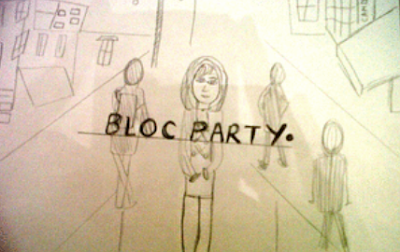
Here are some drawings that have been created of our future Digipak.

Wednesday 7 March 2012

Digipak Poster. How we made it


The process of making our poster.
Here is the font we are using on our magazine advert, this is very similar to bloc parties font they usually use. We want to use the same house style as other bloc party posters to make our poster look alike and be recgonised.

Using www.dafont.com we come up with this font. The font is called CODE and looks very similar to Bloc party's font they usually use. CODE has a normal and a bold. The masthead is in the font CODE. We have chose to do this because by using this font it is clear to see who the band are on the magazine advert.

Here is the gradual process of making the magazine advert, we added in relevant pictures to the music video and the poster. we then took tips from other celebrity posters when adding in effects. We added in rating, quotes and business icons!
We feel this looks really professional lets hope the rest of our digipak does too!Here are the images from our video used and the business icons we used to make the poster look realistic.

Monday 5 March 2012

Target audience for digipak


OUR TARGET AUDIENCE FOR OUR DIGIPAK IS PRETTY MUCH THE SAME AS OUR TSRGET AUDIENCE FOR OUR VIDEO.
THE AGE RANGES FROM 16-25, BOYS AND GIRLS THAT HAVE AINDIE URBAN EDGE TO THEM.
WHAT WILL OUR TARGET AUDIENCE BE LIKE??
They’ve got the look – here’s how to spot Scenester chic in Britain
Wearing:
Foppish, floppy haircut
Waistcoat
Thick rimmed glasses
A lovely coiffeured fringe (on both boys and girls)
Cardigan
Stripy T-shirt
Brightly-coloured socks
Bleached hair for the girls
Tight jeans, maybe white?
Pork-pie hat
Braces
Harrington-style jacket
Long on top, short on the sides hair-cuts
Converse or winklepicker shoes
Girls - lumps of hair removed in unexpected places on head

Carrying:
Canvas bag on shoulder (preferably Rough Trade branded)
7 inch by their favourite band
iPod
CDR of their own demo
Pouch of rolling tobacco

Font for digipak

FONT

When looking at the font, we decided that we want to have as similar text to bloc party's other albums as possible. When looking at their text it is clear to see that it is quite robotic and straight. We came across the font, CODE on www.dafont.com.
The font comes in both bold and non bold, this is exactly what we want as bloc party usually have their band name as bold and the album name non bold.
After all deciding that this was an ideal text, we downloaded it to our computer so that we could use this in photoshop.